From a heatmap of the local authorities facing cuts to a graph depicting education spending as a share of GDP.
Here are 3 infographics you need to see.
Each one illustrates a different aspect of school cuts, helping you understand how they’re impacting people across the country.
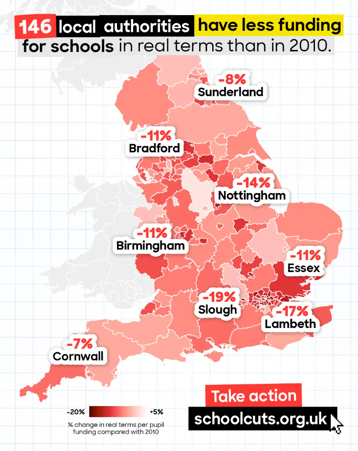
146 local authorities have less funding for schools in real terms than in 2010.
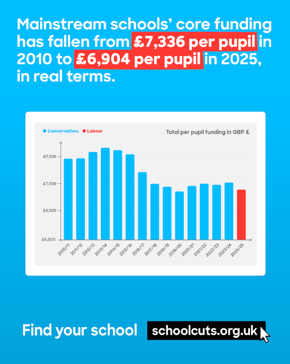
Mainstream schools’ core funding has fallen from 2010.
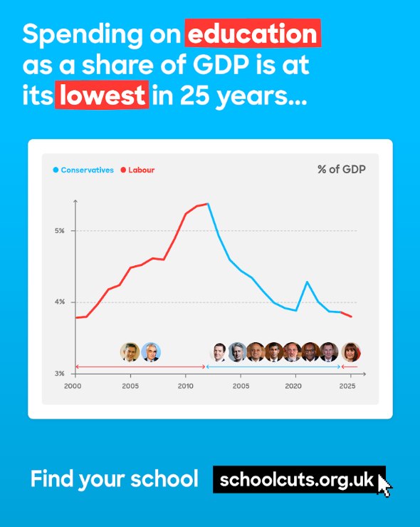
Spending on education as a share of GDP is at its lowest in 25 years.